How to think outside the banner

Zalando
The problem
The masthead on the Zalando homepage had millions of daily views, but not many clicks.
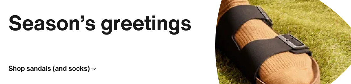
It looked something like this:

The real problem

The masthead followed the design system built to guide users without disrupting their flow..
But this was a billboard disguised as a masthead.
It had to stand out, arouse curiosity, while still feeling like a part of the brand experience.
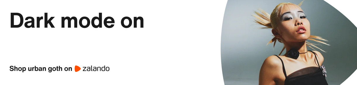
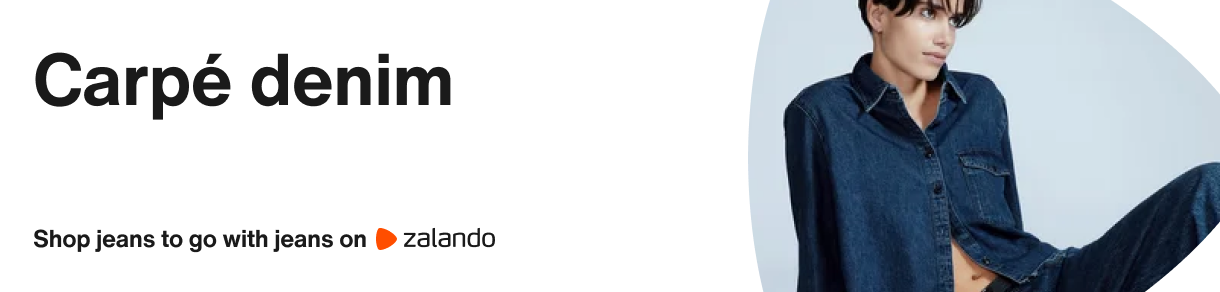
A banner with billboard energy
How to design a new system
Reduce it down to 3 basic elements — headline, image, CTA.
Redesign each one to make it bolder, punchier, distinct at a glance.
Put them together to create a new system: simple, scalable, designed to intrigue.

Taking the system for a ride


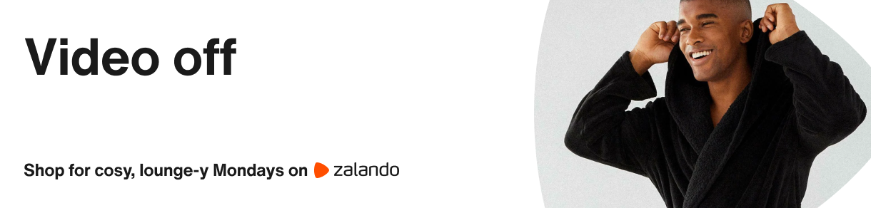
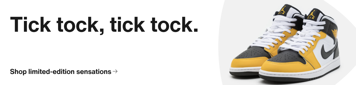
Scaling across channels & categories
I created a guide for teams to adapt the format on their own.
For any product category, in any region, by any business unit who wanted to be featured on it.